King's Men Group &
King’s Men Residential Facility
The King’s Men Residential Facility isn't just a halfway house, it's a bridge to a brighter future. They understand the challenges men face re-entering society after incarceration. That's why their program is built on three pillars: purpose, hope, and opportunity.
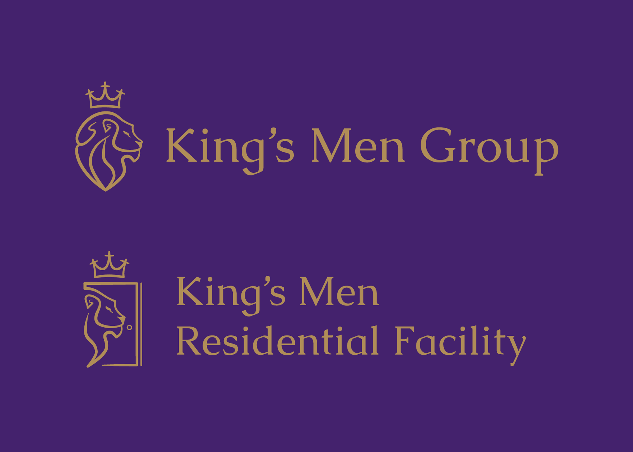
King’s Men Group was looking for a logo and branding identity that would encompass not just their parent company, King’s Men Group, but also subsidiary divisions, such as their new Residential Facility. Their company is Christ centered, showing love through works, and seeking to make a difference in the community by assisting formerly incarcerated men re-entering society.
They wanted a deep purple and bronze as their primary colors, text that was a professional serif font, and a strong logo that was memorable and eye-catching. They wanted an image of a lion and/or a crown, and discussed the possibility of a design that would work within multiple logos and future expansion.
In this design, they’ve been given a lion head logo wearing a crown made from the 3 crosses of Calvary; they were given several variations of the design where I demonstrated how they can modify the logo to take it even further as the company continues to grow and expand into other areas!


